Thursday, August 30, 2018

More Tortured Textures


Once again playing with different textures.

I still don't have any stencils. I haven't seen any in the stores that really interest me. On the other hand I saw a lot of skeletons that did.  They have bunnies, racoons, chameleons...so many new skeleton critters.  I'm generally a poor consumer, there is so much marketing out there that is wasted on me.  But whoever the evil genius is that decided to branch out the skeleton industry should get a promotion.  Every year it gets harder to resist and they're not even anatomically correct.  This year I only bought a bunny and a large frog...so far.  And I had to buy the frog because the small one I have needed a buddy.  So that counts as an act of kindness, not consumerism.  At this rate don't be surprise if I set up the weirdest pet shop scene in a few years.

Anyway, I might have to order stencils online, but that opens up a kagillion possibilities and I'm not good with choices and making up my mind.  So procuring stencils is going straight on the procrastination list for now.

In the meantime I might not have stencils but I have this shelf liner stuff.  It's great for lining the plastic containers that I keep my tools, wire and whatnot in.  The design is really too small to stencil well, but it creates some interesting texture.  I applied product over the top it like you would with an actual stencil, but pressing it onto a thick medium would also create texture.  You could even apply ink or paint on it and use it like a stamp.

You can buy texture paste or you can make your own.  All the recipes I've seen are very similar and use 1-2 parts acrylic paint or gesso, 1 part pva glue or mod podge, 3 to 4 parts talc powder or baking soda. I haven't tried any of them yet, I still have some old spackle I've been trying to use up.  On a side note Monster Mud is 1 part latex paint to 5 parts drywall joint compound. I think you should just mix up whatever you have on hand and see what happens.


From left to right I used a mixture of 1 part glue, 1 part acrylic paint, 2 parts spackle; the center is 1 part latex primer paint to 1 part spackle; the last is 1 part latex primer to 2-3 parts spackle.  All measurements are approximate and all mixtures were applied randomly.  A scientific comparison this is not.  Those are finishing nails along the center piece.


My other not-stencil is a plastic mesh liner that came with the pizza we ordered a few weeks ago.  Again I used it as a stencil, but it could be used other ways too.  From left to right they show the same mixtures I used above.

The middle piece with the 1:1 primer and spackle mixture was too thin.  You can't tell by looking at it now but the pattern was uniformly stenciled over most of it.  It kind of oozed together.  The really fine grid texture towards the bottom is from a piece of cheesecloth that I accidentally laid on it and removed before it was finished drying.  One of those interesting mistakes to keep in mind for future use.

The last one with the thicker mixture was a little too perfect, so I used a broken tongue depressor to create some interest.  I like how the jagged edge creates lines of varying depth.  Come to think of it, glued on jagged pieces of broken tongue depressor would be cool too.


One more thing on my list of things to try has been ink sprays.  The same day I picked up that embossing folder there were inks on clearance from the Dylusions line of Ranger inks.  They were all two packs containing Fresh Lime and London Blue. I've heard good things about Ranger inks, why are these two colors so sketchy they were sent to the clearance aisle?

Never having played with inks, I've been spraying them on everything to see what happens. In this case not much.  The tag above on the left and the one below on the far right I painted with my daughter's old watercolor set.  The others were sprayed with the inks and while they looked amazing wet, once dried the color was barely noticeable. I didn't really expect them to perform well on such a dark surface, but if your looking for a subtle color variation it'll do the trick.


I played around with watered down acrylics over the ink ones.  I have to say I like the watercolors better or maybe I just didn't add enough water to the acrylics. I guess I will just have to play more.


I had a lot of fun with my pizza and shelf liners. I think they would make awesome faux reptilian skin.

Sunday, August 26, 2018

Sugar Skull Coloring


I recently went to an adult coloring book party, which is a fantastic idea by the way.  I believe the general consensus was that coloring is relaxing and fun, but non us would take the time to do it on our own. Making it a social activity is brilliant.  For an introvert like me, I loved the fact that I could bounce between socializing and being anti-social with no one being the wiser because everyone was busy coloring.

I have had Marty Noble's Sugar Skull coloring book for over a year and never touched it. Not all coloring books are equal, and in my opinion coloring books geared towards those with eclectic interests seem to have a higher percentage of poorly done pages seemingly churned out just to fill a niche.  That is not the case here.  Beautiful pictures, professional quality, I can honestly recommend this book if you like skulls and coloring.

Right before leaving for the party I had an idea.  I copied some of the pages onto watercolor paper.

I now have a laserjet after having a inkjet for many years.  I love it. Printing artsy stuff in color requires tweaking the settings to get close to inkjet quality, and the toner is expensive.  On the plus side the toner seems to last forever, and as infrequently as I printed in color my ink cartridges were always drying up anyway.  And now I can use wet mediums on images without the colors smearing.

I trimmed the watercolor paper to fit my printer tray.  Printing on watercolor paper was a little messy, the next image I copied had print from the previous page on the backside.  Maybe I could fix that by fiddling with the settings, but I just alternated printing on regular paper with the watercolor paper.  It only took running one sheet of printer paper after the watercolor to clean things up.


I started one picture with watercolor pencils, but I got tired of pressing really hard and even then the colors weren't that vibrant.  I did this one in Sharpie and Bic permanent markers . I was sure how much white space to leave or how the colors would blend. 


This is what it looks like after spraying it with rubbing alcohol. Some colors seem to spread more than others. Not surprising fine point markers spread more than ultra fine point ones. I sprayed the alcohol on by flicking it off a stiff paint brush. I think I'll get a small spray bottle for a finer even mist for next time. Also I wish I would have slowed down a bit and started with less alcohol and patiently waited for the colors to spread. Then I could have added more alcohol a little at a time as needed. After it dried I colored the eye sockets and outlines black.

Next on my list is to try the kids washable markers and see how they react with water. 

All in all a very fun little experiment, that if not for a party invite, I would never have thought of.

Saturday, August 18, 2018

Tortured Textures

I'm gearing up for the annual Halloween craft party.  This year the main focus will be the mixed media altered bottles we started to touch on last year.  I say bottles, but really these techniques can be applied to any surface.  


I recently stumbled on Maremi SmallArt.  I've watched a couple of her videos on different methods of creating texture and a couple on creating art with junk you might have laying around.  Her videos are quite long and chatty, but very entertaining and informative.  She's like the Bob Ross of mixed media.  For someone like me who isn't very outwardly expressive it's almost cathartic listening to her. Not to mention all that joy is conveyed with the coolest accent, although being from the Midwest I think pretty much everyone who doesn't sound like me has a cool accent.  The videos I watched were long, but she covers a lot of ground quickly and efficiently.

There's one thing she said about creating art in one of her video's that I absolutely adore, "Be spontaneous. Be fearless." Alright, enough about Marta. But you won't be disappointed if you check out her channel.

One of things I loved about her texture videos (Ok I'm not done talking about her.), is she used the cardboard backing from packaging as her base.  I've been trying out different things on full projects, like twine & seeds, eggshells, plastic bugs, flowers & buttons and molded pieces.  It's been a slow process.  Watching her I realized how wonderful it could be to do smaller projects and try a bunch of textures in a short amount of time.

For my base I used countertop samples from almost two decades ago.  Can we say hoarder? When we were picking out countertops I couldn't decide and I have so many samples but I couldn't just throw them away.  I used some to make a faux floor for a pumpkin years ago but otherwise nothing has come of them.  For this I used the blank side of the samples as my canvas. Everything is painted with a layer of flat black and highlighted in champagne gold. I kept them very simple and only used items I already had.


My first texture comes from embossed tinfoil.  Using texture paste with stencils has been on my list of things to try.  So when I saw this neat stencil on clearance I figured now was the time.  Except it's not a stencil it's an embossing folder.  I didn't know such a thing existed, but now I have one.

The image is raised on one side and depressed on the other, so that when the folder is closed they nest together.  A piece of paper is placed in the folder and normally pressed with a little machine and then you have a nice imprinted design.  If you don't have a little machine you can use a rolling pin and a little muscle.

The thicker the paper the more effort required but tinfoil takes almost no effort at all.  I do recommend tearing the tinfoil into the sizes you want prior to pressing.  The other way around and you will press out the design with your fingers wherever you hold it to tear.


On the left we have a base layer of tea bag with pieces of embossed tinfoil depressed side up.  The right is a layer of tissue paper topped with embossed tinfoil with the raised side up.


And this is what they look like with stuff glued on.  Glass half marbles over pictures from a GrandinRoad magazine*, a bit of cheesecloth, a bottle cap, and a piece of scrap wire randomly twisted and lightly hammered flat.

*I admit I ordered their magazine just for the pictures, but they do have some cool stuff.  They also have some items that look like overpriced cheaply made knock-off's of stuff other crafters have done, but all the big kids are doing that these days. I did end up buying a half dozen skeleton mice from them last year, so I guess it does pay to advertise.  I got a really good deal on them after Halloween.  I bought the mice to use as rats since they are more rat size, whereas I think their rats are miniature Chihuahua sized. 
   

This is me painting already attached cheesecloth black.  I painted it flat on parchment paper, so I wouldn't get paint on the glass and after it was dried I wrapped it around the edges of the glass.  I thought this in-between moment was kind of mini work of art on it's own and worth keeping in mind to recreate something similar in the future.  


I liked the texture of these napkins and wanted see how they held up after painting.  I do like how they turned out, even though I'm a little disappointed that as different as the napkins looked, after painting I can't tell which is which.  


And here are the finished projects:


On the left more scrap wire, dismantled fake flower, bottle cap, plastic skull ring, seed beads and some Halloween clearance black stars.  The other is a plastic scorpion, tiny rhinestones, external tooth lock washers and spent (not live) primers*.

*Unless you or someone near and dear to you reloads their own ammo, you probably wont be familiar with these. This is redneck crafting right here folks.  I do clean them before using them for crafting purposes.


The left is napkin again but this time with an overlay of thread.  I've used string, yarn, jute, but never thread.  It seems so thin and insubstantial I never considered it.  Again the inspiration came from Marta, I was really impressed by her use of thread.  My example is not so impressive.  Yes my thread usage adds texture and interest, but I realized afterwards what I like about her method. First she randomly adds texture paste or thick gesso over the thread. Secondly she uses inks to add color and its that combination of bleeding and wicking that really makes it look phenomenal.  

The right side is paper towel, as opposed to the previous paper napkin.  It is thicker and the texture more defined.  


Here they are finished.  The left is another glass marble, this time over an image from an Oriental Trading Co. magazine.  Buttons, fun fur yarn, and thin macramé cord are also used.  The right is more flower pieces, scrap wire, a bead cap and plastic spider.  The spider was first painted with a mixture of dried tea (from the tea bag used previously) and black paint.


I chose the most boring neutral samples I had, in case this project was a complete bust, so the backs needed a little sprucing up too. 


Both of these were painted black and then the paint was removed with a paper towel before it completely dried.  I like how the same technique had very different results by scrunching the paper towel differently and using different pressure.   


The sample on the left already had an interesting texture, so I just highlighted it with black.  The right-hand one is finger painting.  


Here the left-hand side was painted by dabbing the surface with a cotton ball covered in paint. I thought the cotton would stick and come off in bits, it didn't.  What it did do was create a very fine texture that looks similar to sandpaper in person.  The last one is my favorite. First paint was added and removed like the first two, but then around the edges I brushed on the paint mixed with tea leaves leftover from the spider.

So that's it. I got to play around with a lot of textures in a short amount of time.  Now I have an idea of what to expect applying them to other things and I have these mini samples to use for reference at my craft party.  

Sunday, August 12, 2018

Reusable Skull Bags


Another episode in the painters tape saga, this time it's reusable shopping bags.  The ones that I've had for maybe close to a decade have seen better days and been demoted to carrying less than glamorous stuff like dirty shoes and wet beach towels.


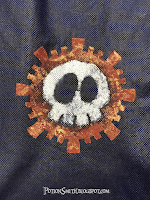
I'm really happy with these reusable bags I ordered off Amazon.  They are just as sturdy as my old bags, and a tad bit larger.  Black would have been my first color choice of course, but it wasn't available when I ordered.  The dark blue is plenty dark enough to contrast with a nice white skull and depending on the lighting sometimes they even look black.


Bounce on over here for the original instructions.


I cut out two templates using them to paint 5 bags each. I probably could have squeezed out another bag or two if I were really careful, but they were starting to lose their stick quite a bit at the end and there was some bleeding under the edges in a few places.

Because of the darkness of the bag I found that using a base color of bright orange for the outer ring helped the metallics pop.

The skull needed quite a few layers of white, which meant a lot of paint build up on the stencils and a thinner stencil gives you better lines. The good news is when the paint builds up like that it's also easy to peal the paint layer off the stencil and start fresh.

Learning from past projects, I drew hash lines across my templates to make it easier to line things up and remember which pieces go with which template. Every few uses the marks needed to be darkened as they were covered with paint, but it really helped.

The plastic bottom inserts came in handy to keep the paint from bleeding through to the other side of the bag.

Then it came time to see how they would hold up in the wash.  I washed the first bag on the delicate cycle of my front loader with the bag turned inside out.  To dry I turned it right side out, folded flat and let it air dry.  A lot of the paint flaked off in the wash cycle.


You would think after all the bags I've done I would have this all perfected by now. Or maybe you wouldn't, but I certainly expect more. At least you get to learn from my mistakes. After the washing didn't go so well, I did a little research. Apparently the acrylic paint flaking off was to be expected because of it's thickness. That makes sense because in the past for this type of thing I've used acrylic paint pens, which I assume use thinner paint for it to flow and I have never had problems after washing. The only reason I didn't this time is because I was doing so many bags. There's a good Instructable here on how to make your own fabric paint by adding acrylic medium to thin it. The really sad part is I already had some, I could have easily done this. In my defense I get paint on my clothes all the time and it never flakes or washes off.
For round 2, I ran an iron over the paint on a second bag before washing.  The material is non-woven polypropylene, so I used the synthetic setting on the iron.  Before ironing I removed the plastic bottom panel from the bag and placed a piece of cardboard underneath the design and a piece of parchment paper over the design.  I ran the iron over it for 30 seconds or so.  After it cooled I washed it using the same method and the results where much better.  Still a little bit of degradation, but not bad. I was going for that distressed look all along, right?


I will have to touch them up with some homemade fabric paint and see for myself how it works.

The bags themselves washed up beautifully, no torn fabric, ripped seams or anything, although I've only washed the two so far.

Oh and I've had quite a few compliments. When's the last time you heard someone express delight over a grocery bag?  So get some bags, grab some creepy clipart and have at it.  No reason you can't be eco-friendly and spooky at the same time.

Thursday, August 2, 2018

Slighty Creepy Candlesticks


From the same estate sale that brought you the ceramic skull, I now give you marginally spookified candlesticks.  When I purchased these candlesticks I had every intention of painting them black and replacing the beads with black ones.  But the more I looked at them, the more I fell in love with the existing marbled colors.  It seemed a shame to bury all that depth under flat black.


So if I wasn't going to turn them a spooky shade of black, I had to figure out another way to creep them up.  My other self imposed challenge was to use stuff I already had.

First I took them apart cleaned all the rusted areas with vinegar, after doing a test patch, and then lightly oiled those areas.  Then they were really bright and cheery looking, so I had to put an end to that.  After some contemplation I decided to use black shoe polish to darken things up.  I applied it to the grooves and creases and then wiped off the excess.

I figured skull beads would lend a little creepiness, but I didn't want to use my good skull beads for this.  Just so happens I have a bunch of plastic skull pony beads. I painted them with the same textured primer paint that I used on the ceramic skull.  Then gave them a coat of black, sponged on  Renaissance Brown and highlighted with Champagne Gold.  I have probably a half dozen paints from the Deco Art Dazzling Metallics line and I really love the colors, much richer than other brands I have used.


The downside of using pony beads is the hole was too big.  To fix that I forced 3mm round beads into the top and bottom of the beads. Some I forced a bit too much and split a few beads.  The beads were cheap coated plastic wannabe white pearls, so yay for using up more junk!  But boo, now I had to paint over the part of them that was visible.  But this time I waited until everything was assembled to touch up the paint in case I dinged anything up.

All in all I like the way the skull beads turned out.  I definitely see myself using them on bottles in the future.  I might even split a few on purpose to get a lower profile.  The nice thing is the mold line runs down either side of the face, so when they do split it's in the perfect spot.

I tried incorporating as many of the original beads as possible. I even refrained from redoing the wiring on the beaded links, which was really hard for the perfectionist in me. I wanted to prove to myself that if every wire link wasn't absolutely perfect the world wouldn't end and it didn't.

I did replace the original split rings, which were too poorly constructed to ignore.  Fortunately I happen to have some antique copper split rings that I bought by accident.  Split rings are awesome for durability, but I don't like the way they look. I don't why, I just don't.  With my jewelry I always double up on jump rings whenever the design allows for the added security.  Here I think a single jump ring would have sufficed and looked better, but since I was on a roll using up junk I've been sitting on, split rings it was.


I touched up the paint when everything was on the candlesticks.  I held a gloved hand behind the strands so I didn't paint the candlestick, but everything else including the wire got a little paint on it and that's ok.  After I touched up the skull beads I purposely sponged paint on all the other beads to give them a more uniform look.

So subtly creepy, far from perfect, not even close to my original vision and I'm ok with that.